
Wednesday, April 29, 2015
Monday, April 20, 2015


Monday, April 13, 2015

Monday, April 6, 2015

Wednesday, April 1, 2015

Downtown Lynchburg Signage

Logo is eye-catching and message of purpose is clearly displayed.

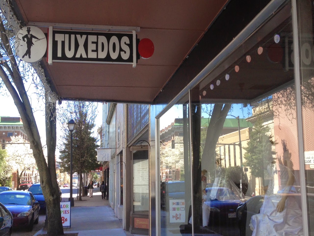
"Modern" twist on a classic Barber shop sign. Art Deco-based serif typeface works well to exude elegance and luxury.

Logo is well designed and typeface grabs target attention. Combination of serif and sans serif works well with clean legible lines.

Definitely has a clean design - coloring and layout help draw target to the display. Legibility is key.

Sleek and Sophisticated - draws in the "fine living" clientele and combination of sans serif weights creates hierarchy.

Typeface choice works well with purpose. Layout and tangency of title need a little tweaking.

Nice handwritten typeface - not necessarily the best choice in terms of purpose. Not enough information.

Clean and legible sans serif type. Leading could be smaller.

Unique-ties to purpose and audience but difficult to read based on placement. Kerning and leading could be bigger.

Funky and fun combination of typefaces. Fits purpose of a unique environment.

A little bold and band in terms of color and layout but effective in message.
Nice concept of layout - grabs attention but kerning could be larger for legibility.

Legibility is not so good. TOO many signs to understand purpose.

Body copy too small - could have used a serif typeface. Stars distract from information. Not sure who the target audience is.

Nice spacing, size is hard to read.

Leading is too big compared to the size. Not sure the target audience if it wasn't in the name.

Window display cool up close but from a distance is illegible.

Background pattern with color made legibility difficult.


Lots of white space -arching words?
Subscribe to:
Comments (Atom)